 Nordlys
 As an open-source project, you have full freedom and control over how you want to use Nordlys. You can adjust any page, component, or style according to your preference. But, depending on what you want to accomplish, this might not even be necessary! Nordlys offers lots of configuration out-of-the-box, so make sure to read through this post first.
theme.config.ts
On startup, the theme reads all its settings from the src/theme.config.ts. For most common customizations, you may only need to modify this file. Thanks to TypeScript, this file is typed and displays warnings if options are missing or malformed. Some of its settings are mandatory, some are optional and will fall back to defaults.
Very important to modify are obvious properties, such as site url, title, description, author, and language. You may also want to adjust the links & logos displayed in the navigation bar or footer.
Optionally, you may also choose to change more visual settings, such as colorScheme, the number of posts or projects to display, whether to display them as list or grid, the syntax-highlighting theme or specific icons to match your post tags.
Generally, it could be fun and helpful to just play with all the listed settings and see how the look of the template changes!
Color schemes
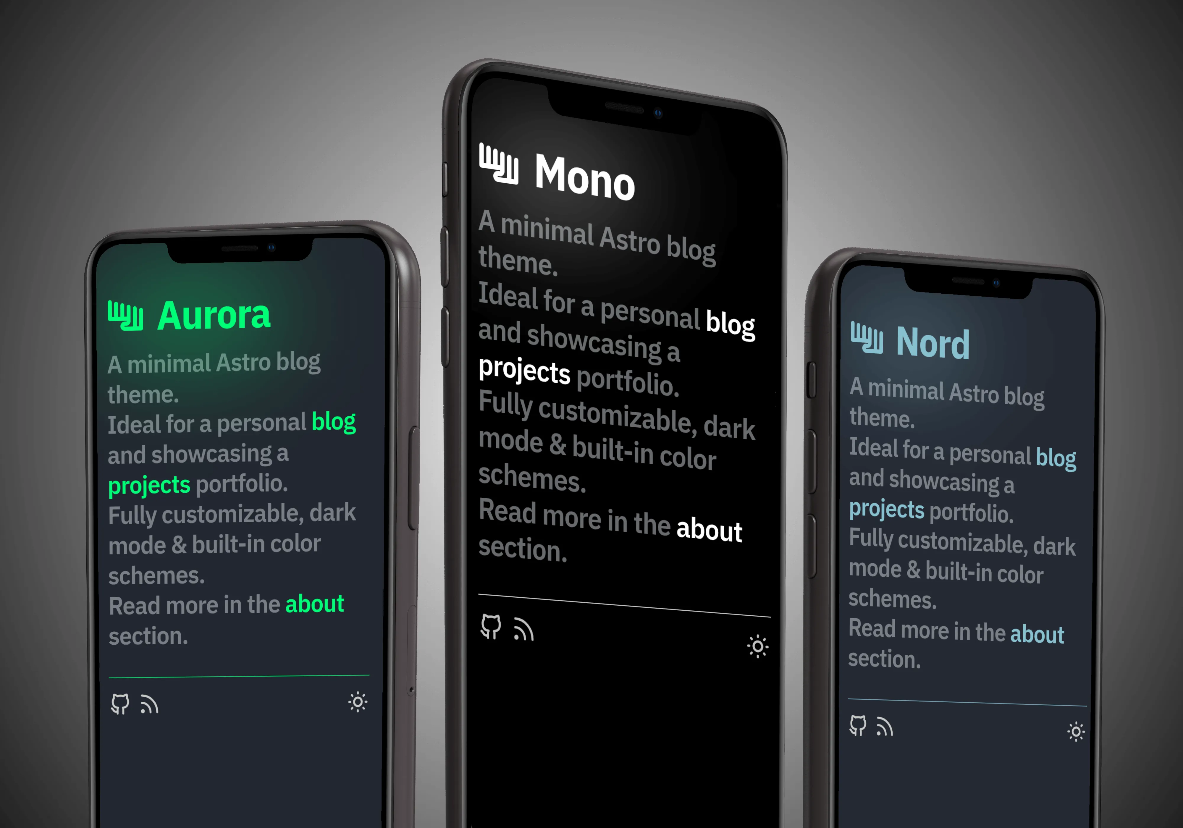
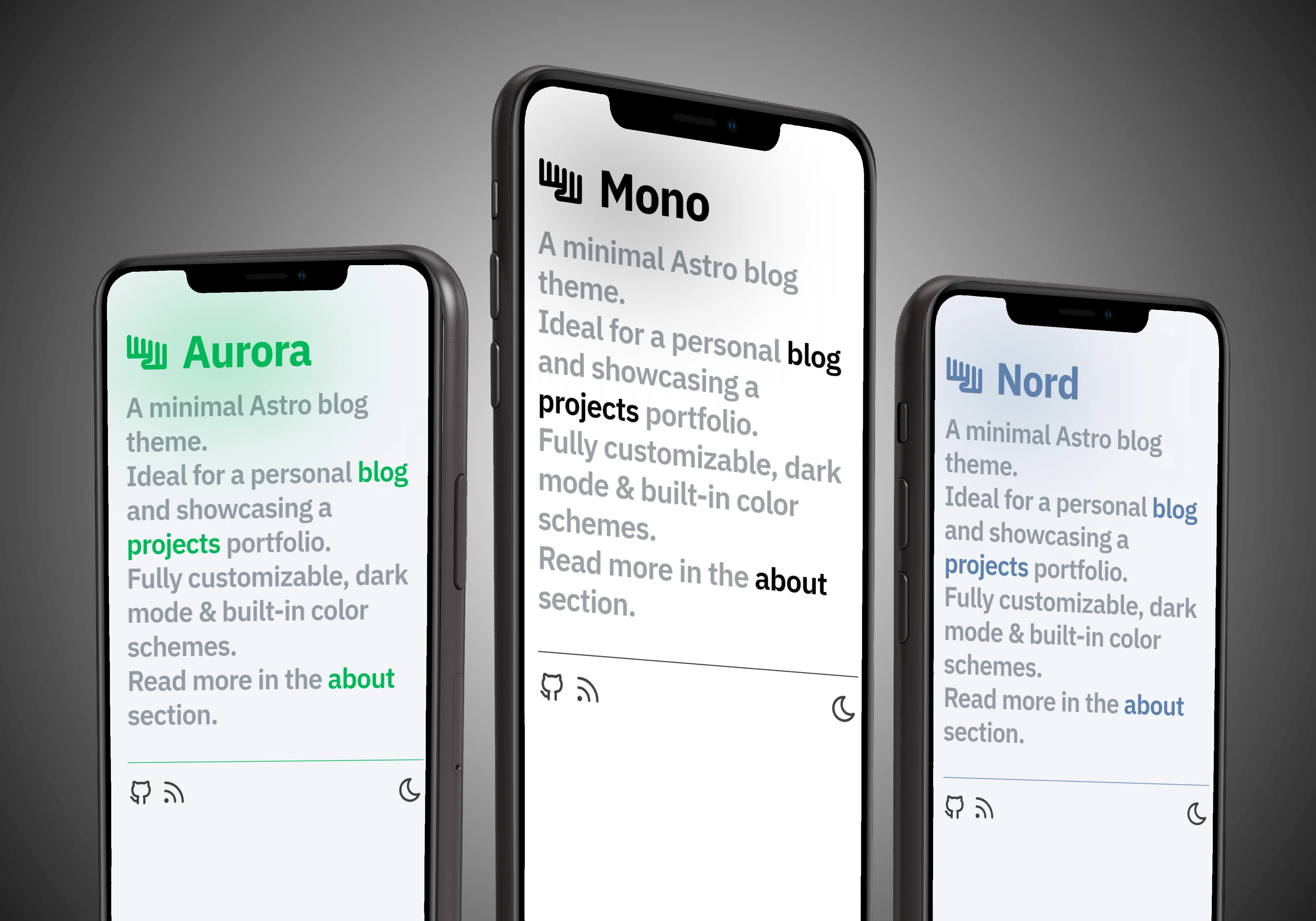
Nordlys not only features a dark and light mode, but also predefined color schemes, as well as the option to add custom schemes.
Existing scheme
Simply set colorScheme in the theme configuration (theme.config.ts) to one of the predefined schemes mono, aurora or nord, which have both a dark and light variant.
Custom scheme
In addition to the predefined color schemes, it’s very simple to add a custom scheme. Just choose a primary (accent) color and a background color, and add them to color-schemes.css. Make sure to use the RGB values of the colors in the same format as shown.
@layer base {29 collapsed lines  .scheme-mono {    --accent: 0, 0, 0;    --accent-bg: 255, 255, 255;
    &[data-mode='dark'] {      --accent: 255, 255, 255;      --accent-bg: 0, 0, 0;    }  }
  .scheme-nord {    --accent: 0, 0, 0;    --accent-bg: 255, 255, 255;
    &[data-mode='dark'] {      --accent: 255, 255, 255;      --accent-bg: 0, 0, 0;    }  }
  .scheme-aurora {    --accent: 0, 183, 86;    --accent-bg: 242, 244, 248;
    &[data-mode='dark'] {      --accent: 0, 253, 119;      --accent-bg: 35, 39, 48;    }  }
  .scheme-custom {    --accent: 0, 0, 0;    --accent-bg: 255, 255, 255;
    &[data-mode='dark'] {      --accent: 255, 255, 255;      --accent-bg: 0, 0, 0;    }  }}
If you want to use the newly defined scheme, set it in the theme.config.ts.
export default defineThemeConfig({34 collapsed lines  site: 'https://nordlys.fjelloverflow.dev',  title: 'Nordlys',  description: 'A minimal Astro blog theme',  author: 'FjellOverflow',  navbarItems: [    { label: 'Blog', href: '/posts/' },    { label: 'Projects', href: '/projects/' },    { label: 'Tags', href: '/tags/' },    { label: 'About', href: '/about/' },    {      label: 'Other pages',      children: [        { label: 'Landing page', href: '/' },        { label: '404 page', href: '/404' },        { label: 'Author: FjellOverflow', href: '/authors/FjellOverflow/' },        { label: 'Tag: documentation', href: '/tags/documentation/' }      ]    }  ],  footerItems: [    {      icon: 'tabler--brand-github',      href: 'https://github.com/FjellOverflow/nordlys',      label: 'Github'    },    {      icon: 'tabler--rss',      href: '/feed.xml',      label: 'RSS feed'    }  ],
  // optional settings  locale: 'en',  mode: 'dark',  modeToggle: true,  colorScheme: 'scheme-custom',  openGraphImage: undefined,  postsPerPage: 4,9 collapsed lines  projectsPerPage: 3,  scrollProgress: false,  scrollToTop: true,  tagIcons: {    tailwindcss: 'tabler--brand-tailwind',    astro: 'tabler--brand-astro',    documentation: 'tabler--book'  },  expressiveCodeThemes: ['vitesse-light', 'vitesse-black']})
Most likely, your IDE or editor will display a TypeError indicating that the scheme is not a valid choice. While this is not a critical error, you can fix it by adding scheme-custom as a valid option to the ColorSchemes array in the type definition.
export const ColorSchemes = [ 'scheme-mono', 'scheme-nord', 'scheme-aurora', 'scheme-custom'] as const